Emily Henderson
Love Wallpaper?? Then Feast Your Eyes On This NYC Apartment (There Are 5 And They Are All Awesome)
BY Megan Hopp
The road to building a career in interior design is much like any endeavor, at the bottom of the mountain you have no experience of the actual climb, the circumference is wide and varied and as a result, you will do anything and everything to start to make your way up. My first official solo client was in 2014, while I knew I had good style impulses and an “up for anything” attitude-I was so so so so very green-my greatest lessons along the way have not so much been in honing my skills (though I have of course improved), but rather in learning how to work with, talk to, and ultimately select clients. The thing about interior design that is so different than most other types of artists is that you aren’t selling a finished product, you are in a constant state of pitching ideas which is so counter to any sort of creative process. Imagine being a painter painting someone’s portrait, and before every brushstroke you take you are required to ask for feedback and ultimately permission before you put paint to paper. However, as time passes and steps are taken up the mountain the circumference becomes narrower and narrower, you learn what you love, what can’t work without and with that little by little you gain agency to work with clients who are in alignment. For me, all roads lead to pattern-any potential clients adverse to wallpaper need not apply.
I am what I like to refer to as a “person with a preference for cosmetic renovation”. Growing my career in NYC, it’s not as if I was ever in the position to rip down a prewar apartment building and start from the ground up. That coupled with the co-ops and building approval requirements galore, I got into the habit of creating spaces that had the most amount of impact with the least amount of invasive construction. I’m not sure which came first the chicken or the egg-but wall treatments, specifically pattern forward ones quickly became the heart of all of my work.
My client Sarah reached out to inquire about hiring me to help transform a recently purchased two-bedroom co-op built in 1960 (and not updated since), into a fresh and custom three-bedroom home for her family, which includes her husband and two young children. In the consultation phase, Sarah shared some images and thoughts on styles she admired, and right away I knew she was going to be a client who spoke my language and would be a privilege to work with. This project was entirely “from scratch” in that with the exception of one small side table there was nothing at all the family was bringing with them to their new home in terms of furniture and décor.
The entire residence was taken down to the studs, the bathrooms and kitchens were gutted, a third bedroom was created and from there we set upon the task of creating a custom home that not only fit the family functionally but was a fully realized comprehensive design where every room and space made a statement on its own but played nicely with the rest of the home.
THE NURSERY
This was the smallest room in the house that we created by walling off what was once a dining nook parallel to the kitchen. We wanted to create a soft whimsy pastoral vibe while not being thematic or juvenile. We opted for the illustration style floral wallpaper that allowed us to use big doses of unapologetic pink elsewhere in the room like the scalloped style velvet chair. I like this print a lot because of its versatility, at some point in the future their daughter might want to shift the look of the space, there are many ways this wallpaper could be built upon to entirely change up the design of the room without changing the walls themself. Throughout the home, we executed custom millwork to do double duty covering up the ever so common NYC HVAC units as well as providing some extra storage be that shelving or cabinetry.
THE KID ROOM
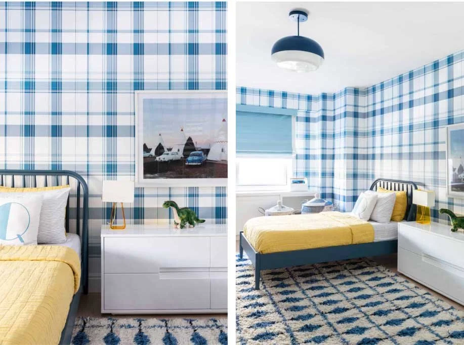
This room is probably my favorite in the home-I have been wanting to do an entirely aggressive plaid room my entire career and it finally came to pass here and now with this little boy. The large-scale blue plaid was one of my first suggestions for the space and Sarah was quick to confirm she was onboard. From there I layered in modern blue and yellow shapes and materials to create a light-hearted but super chic design. Favorite elements of the space include the quirky-cool blue pendant light and bright yellow one-piece desk chair, perfect for climbing all over and homework procrastination (or is that just me?).


